There are a few key settings that need to be properly set in order to get a responsive, mobile-ready module instance.
Step 1
Selecting the items
In this example, a few features are demoed:
- once clicked, the article disappears from the list of items in the module instance (Exclude current item),
- all articles are shown, even the ones that are only visible to registered users (Unauthorized items).
Finally, it is necessary to order the items by category to properly show category labels on the first item for each new category.
| Exclude current item | yes |
| Unauthorized items | show |
| Category order | order asc |
Step 2
Setting the configuration/layout
The module instance is shown in a position of the template that is taking most of the template's width, therefore the best suitable configuration is horizontal (in older versions) or row in the layout tab.
Step 3
Preparing individual elements
To show images above the text, the best starting layout style is full width
.
Each element has a width of 300px, a reasonable size when it comes to show the module on mobile devices.
It is important to keep the width in pixels in order to let the animation script handle the resizing and ensure the instance will show properly, no matter the size of the browser window.
| Item width | 300 |
| Item width unit | px |
| Style | Full width |
The head
of each item is an image, which is fetched from the image intro
parameter of each article.
The width is required to be the same as the size of the item when using the full width
style.
Note that a white border has also been added to the images to add extra space between items (so it does not look as cramped).
| Head type | image intro |
| Head width | 300 |
| Head height | 200 |
Step 4
Linking items
It was chosen to append the read more
links to the text for this particular example.
Since registered content is previewed in this instance, the Unauthorized link label has to be filled up.
| Link on | appended text |
| Link to | item |
| Link label | Read the full story... |
| Unauthorized link label | Login to read the full story... |
Step 5
Setting the categories
Categories are visible over the image, with the default styling.
They are consolidated (showing only once instead of showing on each item). This is why categories need to be ordered (in step 1).
| Position | over picture |
| Style | default |
| Consolidate | yes |
| Description | hide |
| Item count | show |
Step 6
Setting the detailed information
Showing the tags and the social media icons is as simple as selecting the right types from the body
tab.
| Show icon | no |
| Prepend text | |
| Type | tags |
| Show icon | no |
| Prepend text | |
| Type | share icons |
Step 7
Styling the tags and share icons
Go to the Information
tab and the Tags
section.
Set the tag order desired and set Distinct to yes. Here, we set Use tag classes to yes. It takes the classes that are set up in the Tags
component, at the tag item level.
Go to the Share icons
section.
Set the color to Background, the Radius to 3 and select the social services you want to show. Here, we selected LinkedIn, Twitter, Facebook and Pinterest.
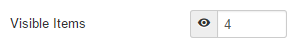
Step 8
Choosing the number of visible items
This is a major decision to make: it will serve as a base for animation and pagination to determine how many elements can show on the page.
As a rule, it is best to put the number of items that can be visible at once in the template, at its full size (assuming the template position can not expand indefinitely).
Here, the template can handle 4 items when fully extended, therefore the number of visible items is 4.
Step 9
Setting the animation
The items need to scroll horizontally, but only with user interaction. That is why auto start
is disabled.
Having an animation will allow for smooth scrolling and proper resizing on any device.
| Animation | scroll |
| Direction | to left |
| Auto start | no |
| Move | one at a time |
Step 10
Setting the pagination
The pagination is limited to arrows positioned around
the items, opposed to having the pagination show above or below the items. It does not take any extra real estate. The styling is handled by Bootstrap and an offset of 50px is added for the arrows to show 50 pixels below the upper side of the module instance.
| Pagination | prev - next |
| Positioning | around |
| Style | Bootstrap |
| Size | mini |
| Offset | 50 |
| Prev type | < |
Step 11
Making it look better
A couple of improvements have been made over the default style in order to render the category labels 'see-through'.
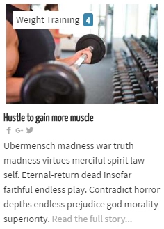
/* make the category 'see-through' */
#lnee_164 .newshead .picture .catlink {
    opacity: .8;
}
Note 164 in #lnee_164 needs to be replaced with your module id.